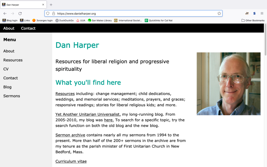
The last time I did a major update of my main website was around 2009. It was looking pretty old and creaky. So I did a complete redesign, and it’s now responsive and html5 compliant.
On the content side, I added some significant new content, including an essay on change management in congregations. I did delete some old outdated content, but I think no one will miss it (if there’s something you do miss, let me know, and I can put it back up).
Thank you Abby, for giving me the impetus to learn about responsive websites (and happy birthday, too!).
Check it out — https://www.danielharper.org/ — and if you see any problems or if you have any comments, please leave them here.


I might suggest adjusting some of the picture sizes
https://www.danielharper.org/images/danhead.jpg
is about 1MB in size and could probably be scaled down before putting on the website rather than depending on the browsers to download then scale. I did note you provided proper alt text
Emma, short answer: thank you, fixed, pictures are now smaller file sizes.
Long answer: The general advice we’re getting these days is to scale images to about 1200 pixels in width, to accommodate everything from phones to retina displays. But although I actually scaled most of my images to 1280 pixels in width or less, what I forgot to do is to compress them adequately. So the image you pointed out is just 1024 pixels in width (i.e., a little small for retina displays, but OK), but it’s uncompressed. Using 70% compression brings the file size down to 94 kb. So I’ve now standardized photo width to 1280, 500 for sidebar photos (graphics vary according to what they’re used for), then compressed image files so that most are under 250KB.