With the shelter-in-place order, any socializing we do is on camera. Plus many of us have to use videoconferencing for work. As long as we’re going to be spending lots of time on camera, we might as well look our best. So here are some tips for making yourself look good on your laptop’s (or your phone’s) crappy little web camera.
First of all, and perhaps most importantly, have your laptop or phone sitting on something stable. Ideally, you want to move the camera as little as possible, for two reasons. First, if you’re in a videoconference, you want to focus attention on your face, and if you move the camera around that’s going to be a distraction. Second, unless you have a really fast internet connection you probably want to save bandwidth; if you have a stable backdrop, that will be less information you’re sending out, and so you’re less likely to have degraded audio or video.
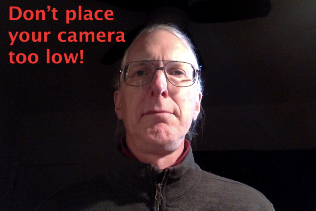
Second of all, don’t place your camera too low. If your camera is too far below your face, people will be looking up your nose, and if you’re middle-aged they can see all those incipient jowls that you’ve been trying to hide. In other words, don’t do this:

Boy, do I look ugly in the photo above! Don’t make yourself look ugly. Place your computer or phone so that the camera is about at the level of your chin. However, don’t place your camera too high; there’s a psychological disadvantage to giving your viewers the impression that they are higher or taller than you.
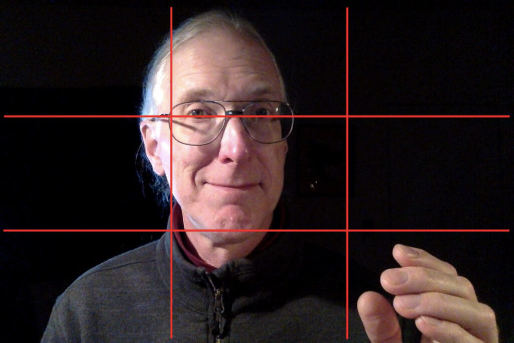
In addition, learn about the Rule of Thirds. Imagine that your screen is divided in thirds both horizontally and vertically, sort of like a tic-tac-toe board. Have your eyes placed so that they’re about a third of the way from the top of the screen. Move so that your head is NOT in the center of the frame, but about a third of the way to one side (I like to move to my left, so that my right hand, my dominant hand, can make gestures in the space to my right). Setting up your camera using the Rule of Thirds will make you look more professional, because that’s what we’re used to seeing in movies and on television.

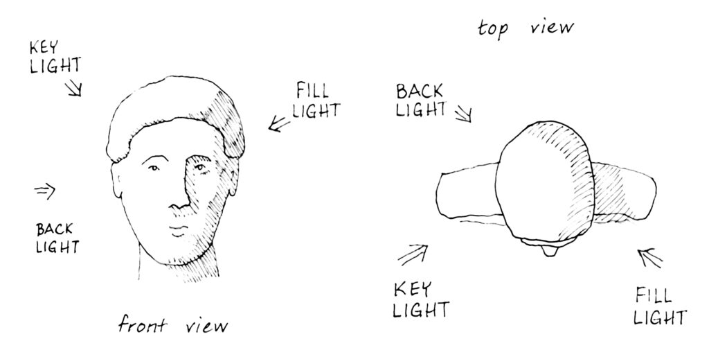
Now let’s take a look at lighting. In movies and television, they use what’s called “three point lighting.” That just means that they use three light sources to light someone’s head. First, you set up the “key light,” which is the most important light. If you’re at home and on a videoconference during the day, your key light is most likely determined by the nearest window — in that case, try to sit so that the light from the nearest window is coming towards you at about a 30 degree angle — and you want diffuse daylight, so make sure there’s a curtain or something to give diffuse light. At night, sit so that the strongest light in the room becomes your key light.
With only the key light, your head will look a little one dimensional or washed out; and if you have any wrinkles or blemishes, they will tend to stand out. Therefore, you need to set up another light, called the “fill light,” which will fill in the stark shadows cast by the key light. The fill light should be less bright than the key light. The drawing below shows where the key light and the fill light come from:

Then if you want really professional lighting, you’ll add what’s called a “back light.” This comes from the same side as the key light, and it lights up the back edge of your head. By lighting up that back edge of your head, it makes you look that much more three dimensional. However, it’s super time consuming to set up a back light, so I don’t bother when I’m on a videoconference.
Now here are some examples of what I look like with these different lights. Here I am with just the key light — it’s adequate, but pretty stark:

Now here I am with the key light and the fill light — my head looks more three-dimensional:

And finally, here I am with a back light. I find it quite difficult to place the back light on myself; I think this photo would have been better if the back light had been pointed a little higher on my head, instead of just above my ear:

All the photos above were done with the crappy low resolution camera in my laptop. If you have good lighting, you can produce good images even with a crappy camera.
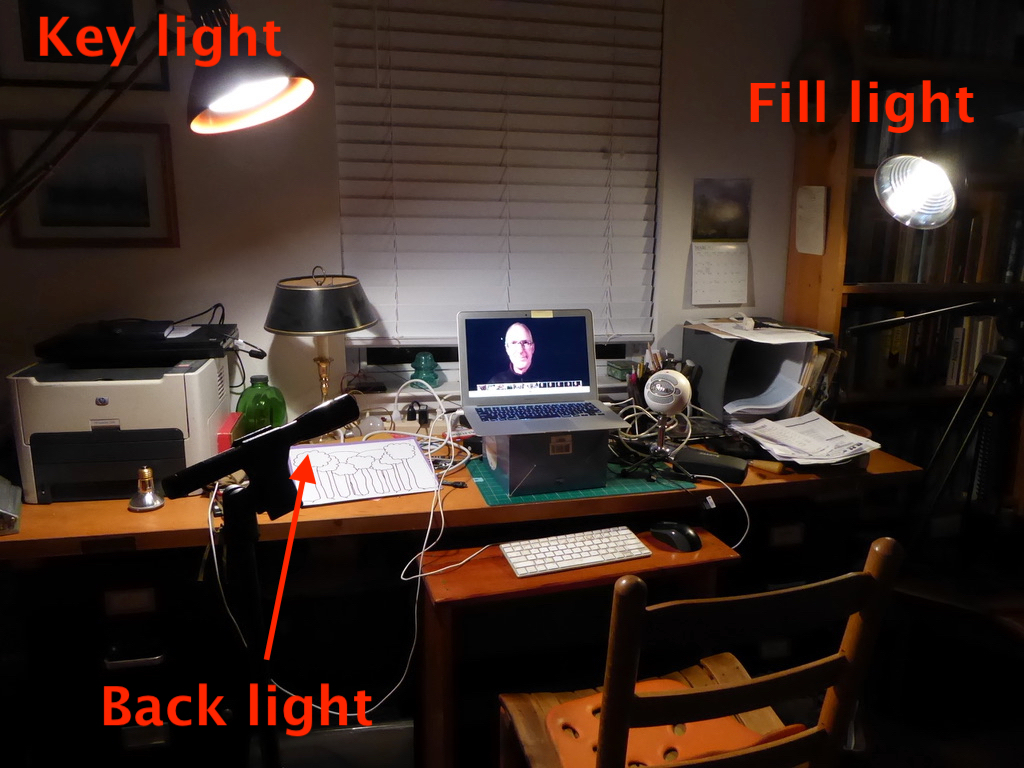
And now, here’s a photo of what my lighting set-up looked like for these photos. The key light is my regular swing-arm desk lamp, which has a bulb that provides a slightly blueish light. The fill light is a clamp lamp, clamped to a bookcase, with a bulb that’s about half as bright as the key light, and which gives a warmer light. Finally, the back light is a LED flashlight on a tripod.

As I said earlier, setting up the back light was difficult and time-consuming. Setting up the key light and the fill light, on the other hand, took me less than five minutes, and will give you perfectly adequate lighting for a videoconference.
By now, you’ve also figured out that I minimize the background as much as possible. That’s easy at night: I point the lights at my head, making sure whatever is behind me remains dark. During the day, it’s more difficult for me. Our spare bedroom, where I have my home office, has windows on two walls, and a huge mirrored sliding closet door on a third wall. The mirror is very distracting when videoconferencing, and for the moment I’ve hung some decorative cloth over it; eventually, I’ll get some plain white curtains to cover it, which will provide a good distraction-free background.
Another obvious point that you’ve figured out: don’t sit with your back to a window. Your face won’t be lit at all, and you’ll look like crap.
To conclude:
If you’re going to be spending a lot of time videoconferencing, why not look your best? Spend a few minutes to make yourself look good:
— Place the camera on a stable platform, level with your chin;
— Spend five minutes setting up a key light and fill light;
— Get rid of distracting backgrounds.

Should improve the remotr algebra sessions. Don calls this an illuminating manual.